Correos
Designing Correos’ brand and image project was a challenge, taking the boring, grey image of a state-owned company and giving it a modern, competitive visual identity with Correos yellow taking centre stage.

This job required boosting the brand at street level, and creating a perception among users of a high-quality, dynamic delivery company. One of the key decisions was to bring the yellow to the forefront.


They also wanted to retain a traditional note, to recall the origins of the company, and for this we found the symbol of the post horn very useful in developing the look and feel.
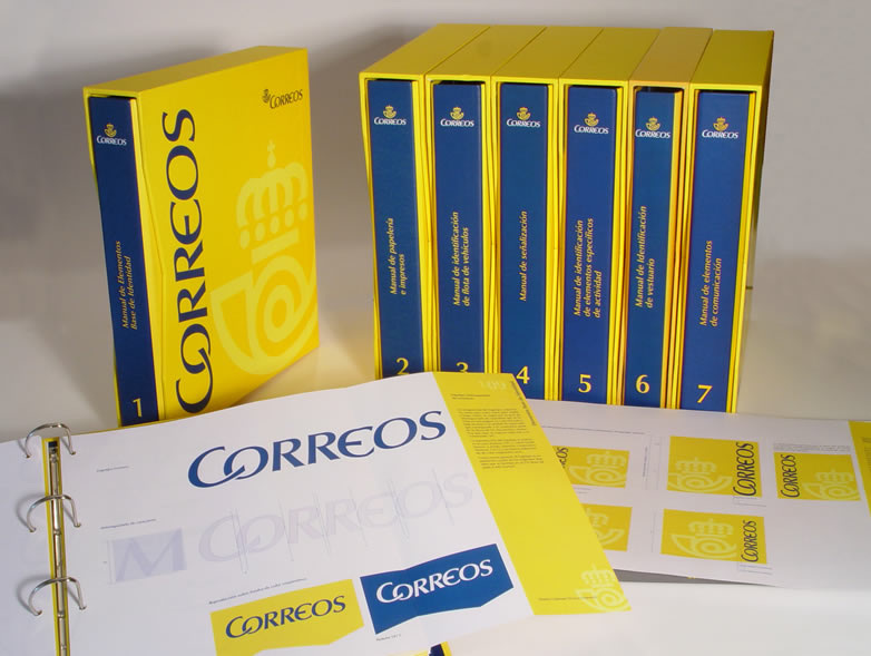
Finally, the entire image project was standardised in a brand handbook covering printed matter, signage, uniforms, vehicles, publications, etc.


